User Research
I interviewed 5 Disney+ users (ages 22-35, streaming 3-5x per week) to understand their pain points with the current app experience. Here are key takeaways from the user interviews:
2/5 users struggled to discover new content
4/5 users missed the "continue watching" section
Users wanted more personalized recommendations
Visual hierarchy made content feel repetitive
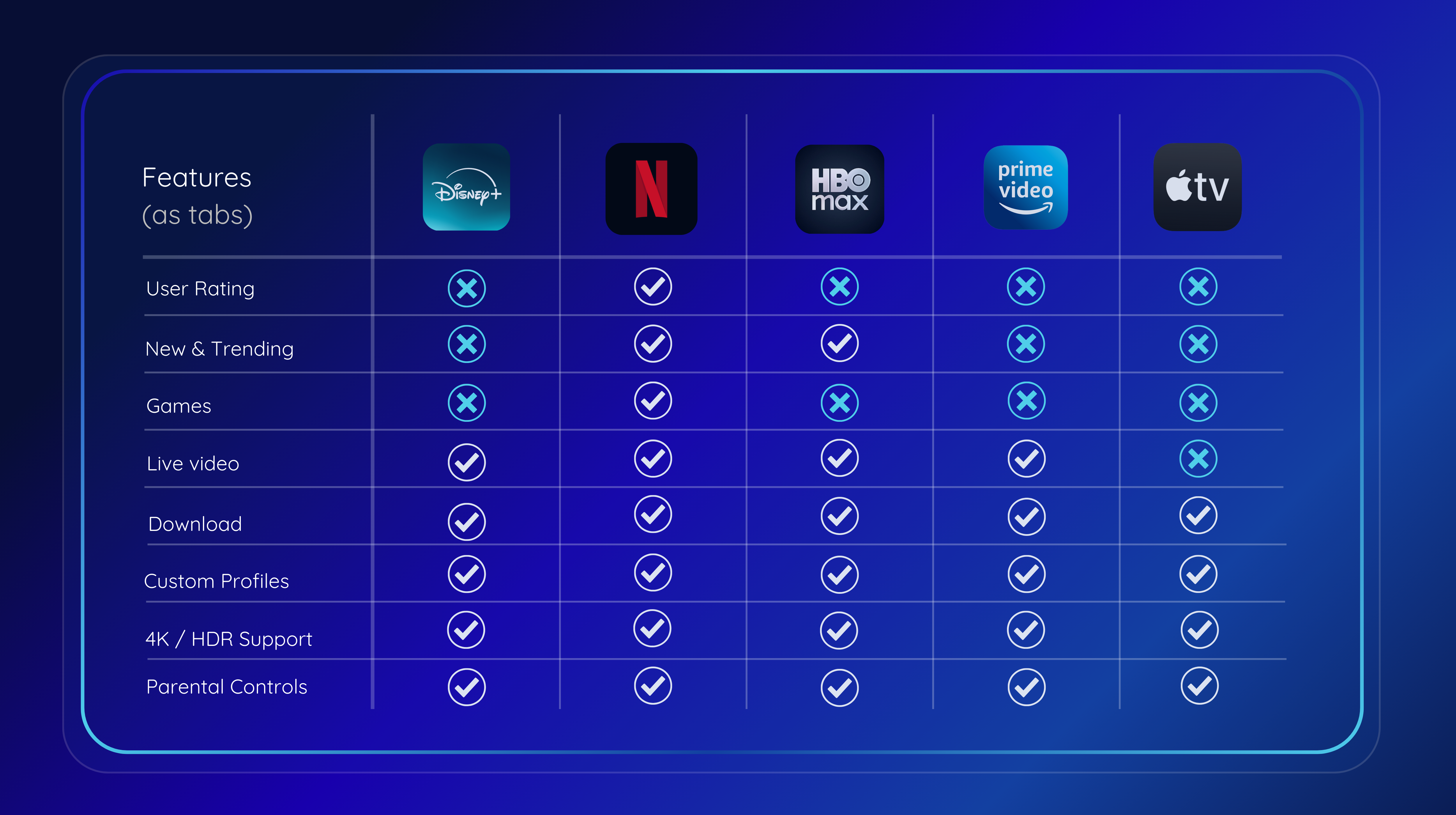
Competitive Analysis
After reviewing Disney's competitors, I added the option for games. Disney's strength is the nostalgia it brings to its users. I leveraged this and added the desktop games from the 2000s.
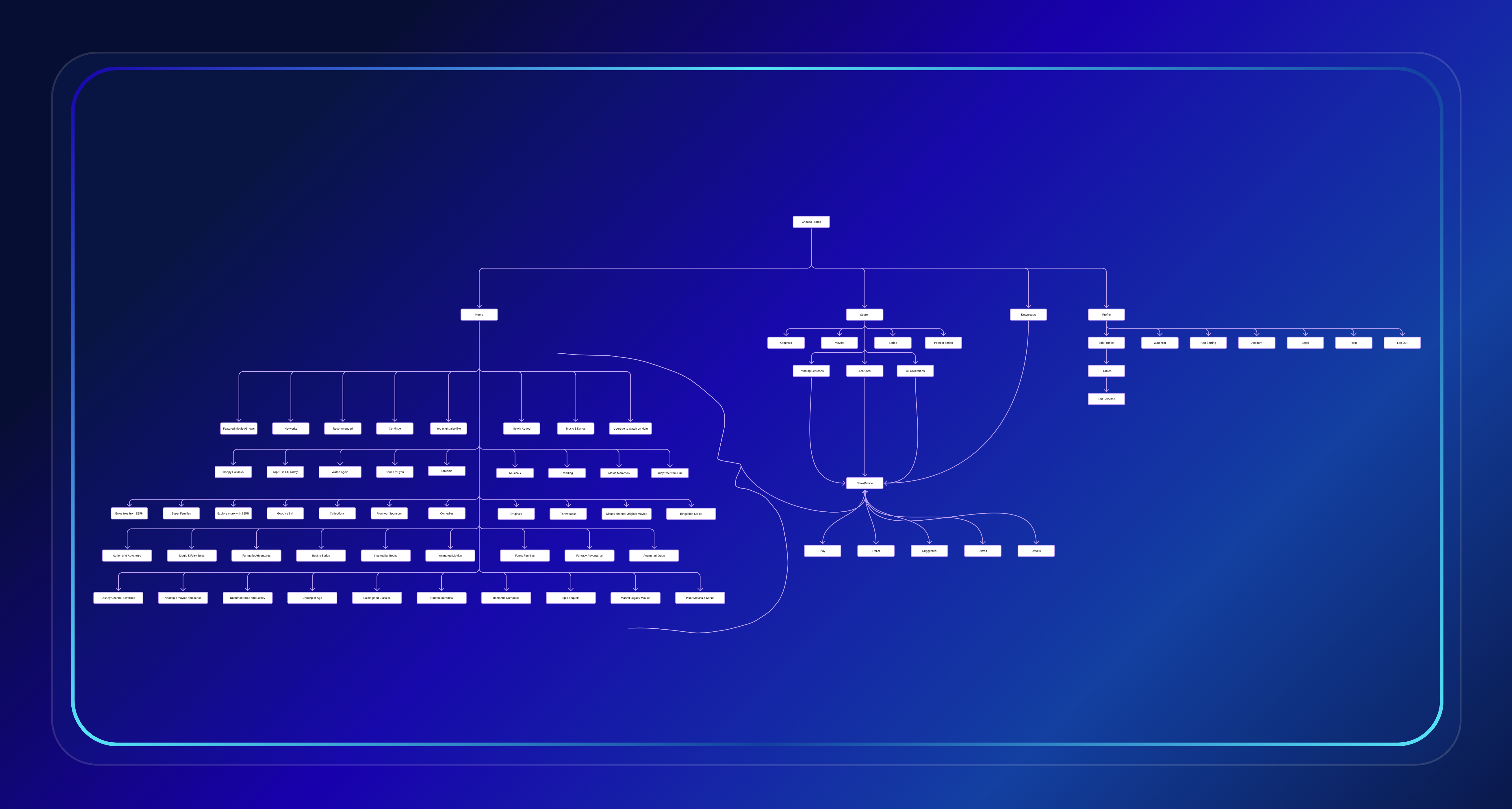
Information Architecture
The user journey map shows the steps users take when interacting with the Disney+ app.
Solutions
Improve content discoverability
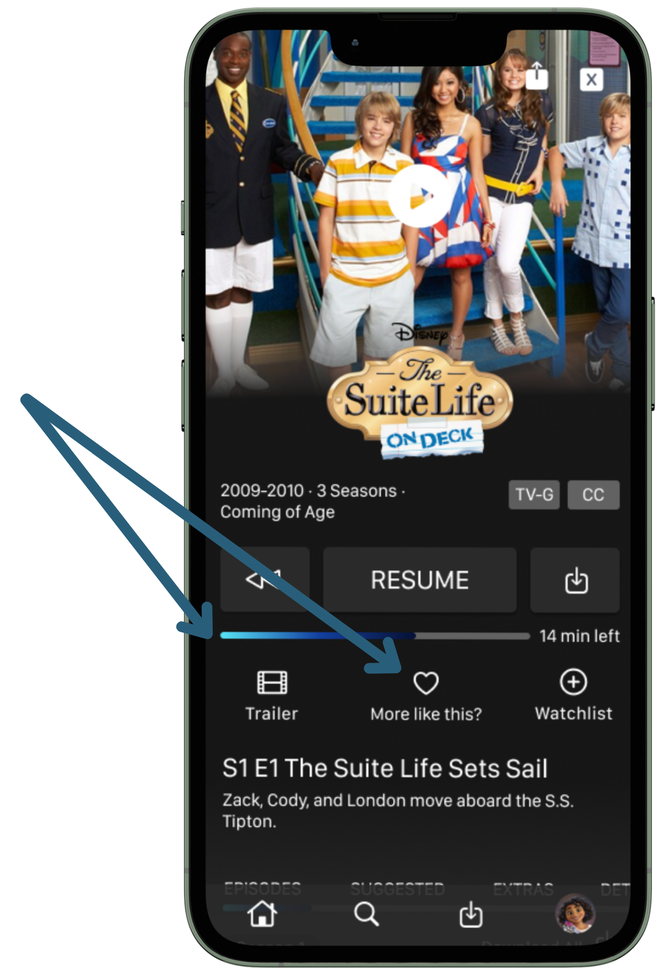
Add "More Like This" feature
Enhance visual hierarchy by increased contrast and moved key sections.
Personalization through Nostalgic games feature unique to Disney
New Design
Final Design
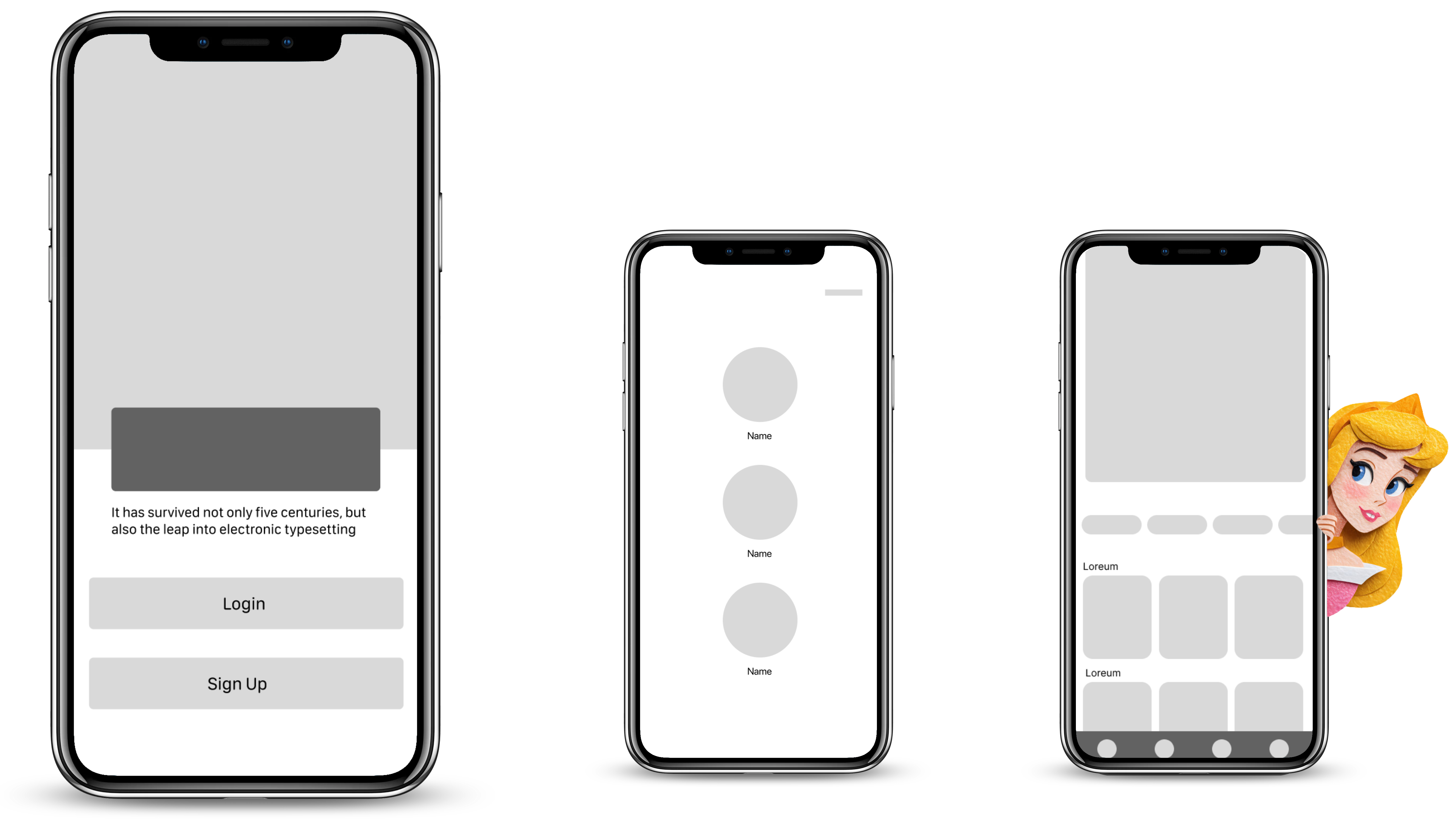
Working from user journey maps and research insights, I sketched initial concepts.
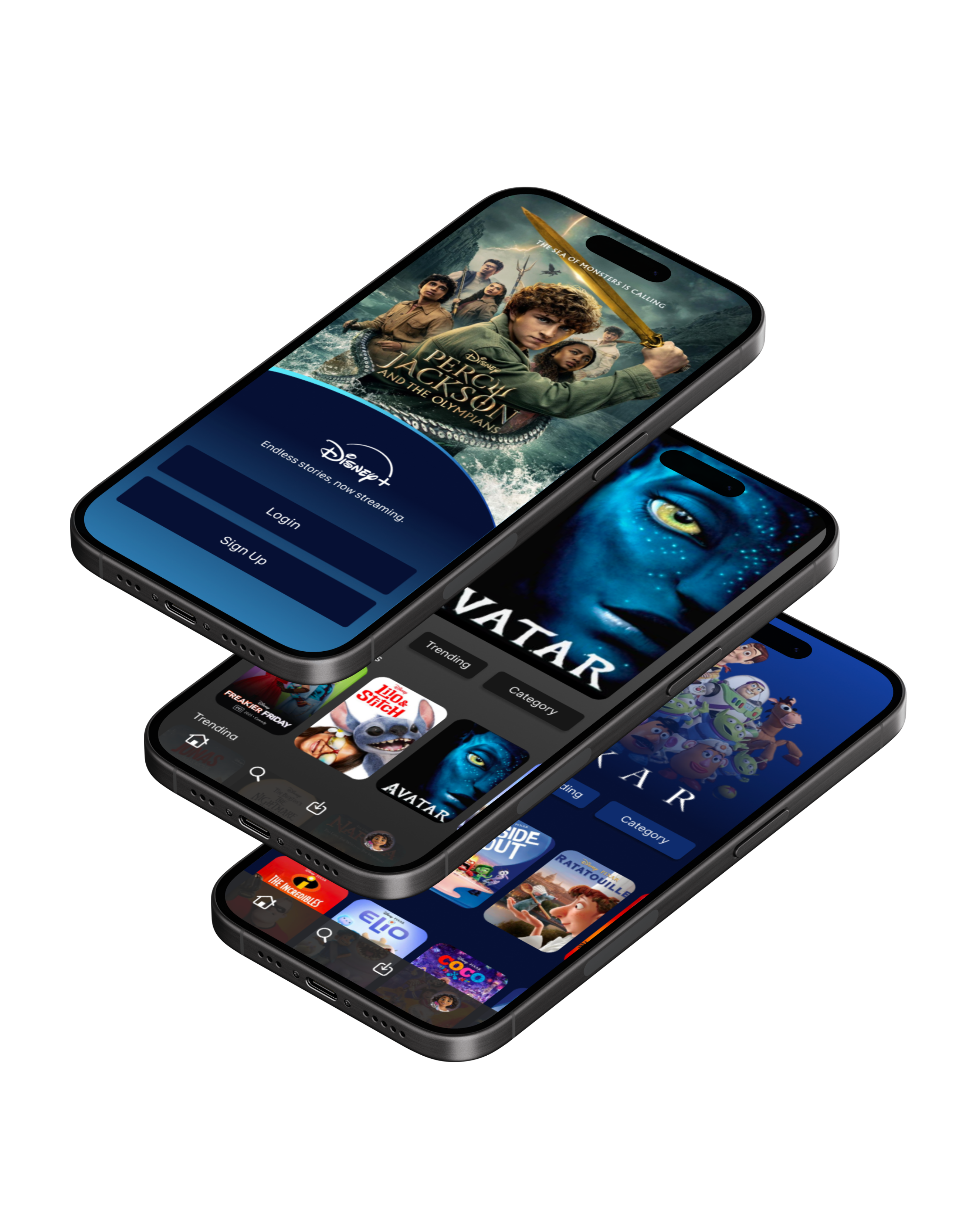
View Prototype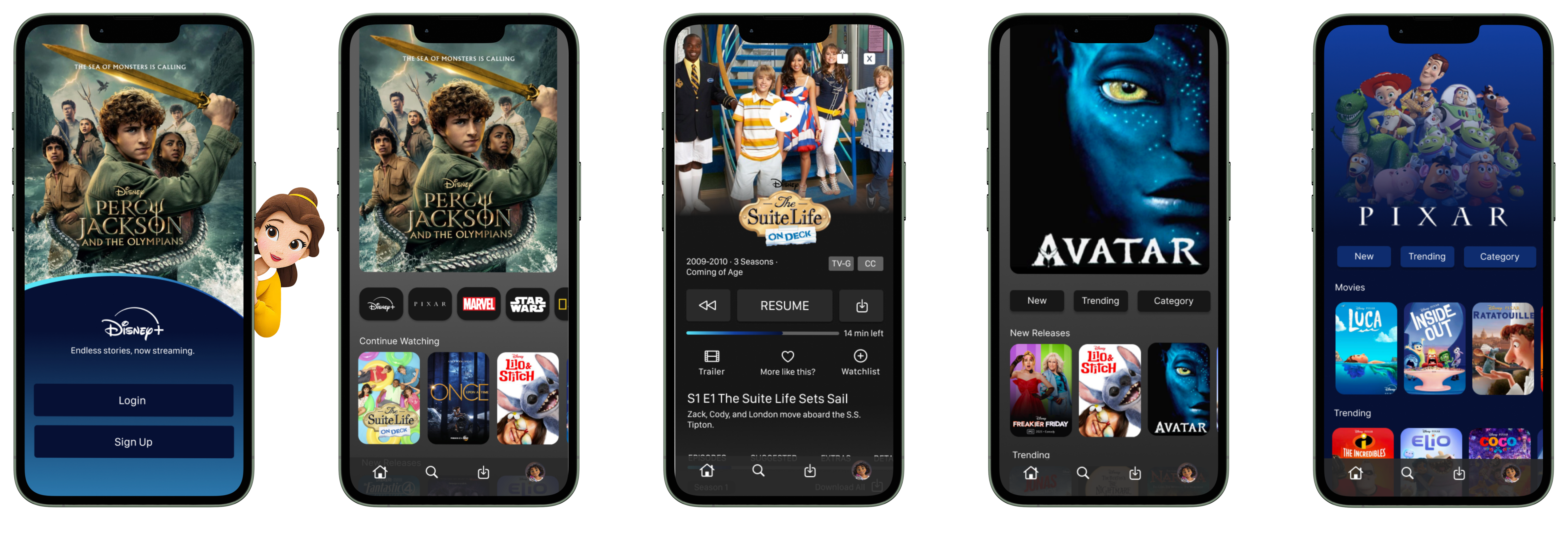
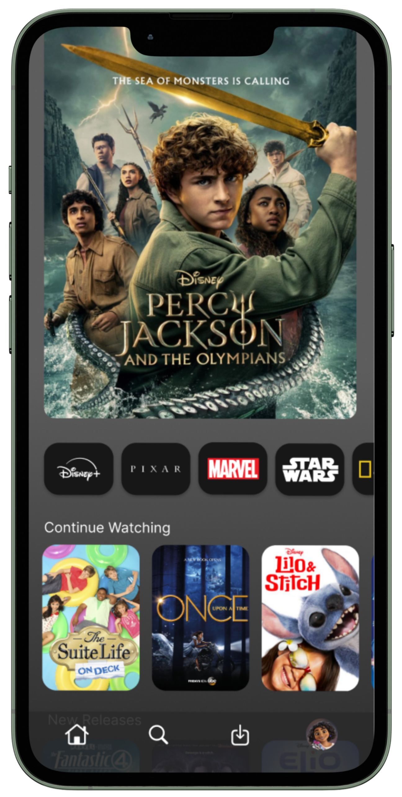
Changed the productions list into a horizontal scrollable list. Allowing space for the "Continue Watching" section at the top.
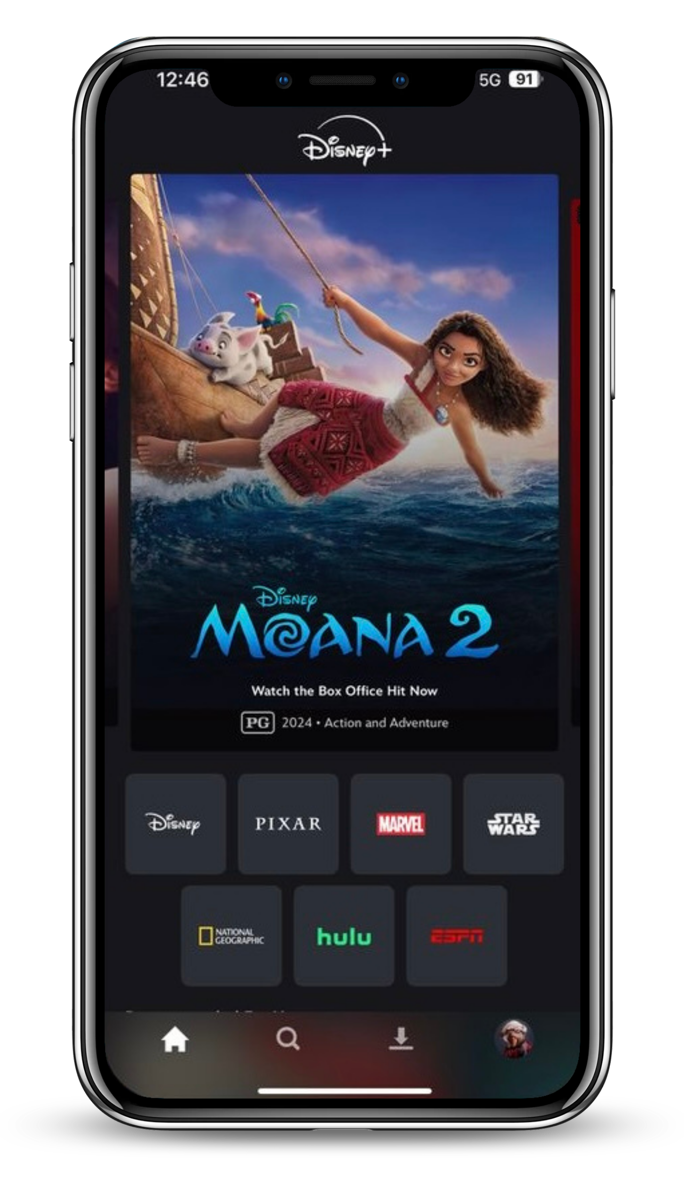
Previous Design: Production list took up half of the screen, limiting space for other important sections.
Added Progress bar and a "More Like This" button. Something the app did not previously offer.
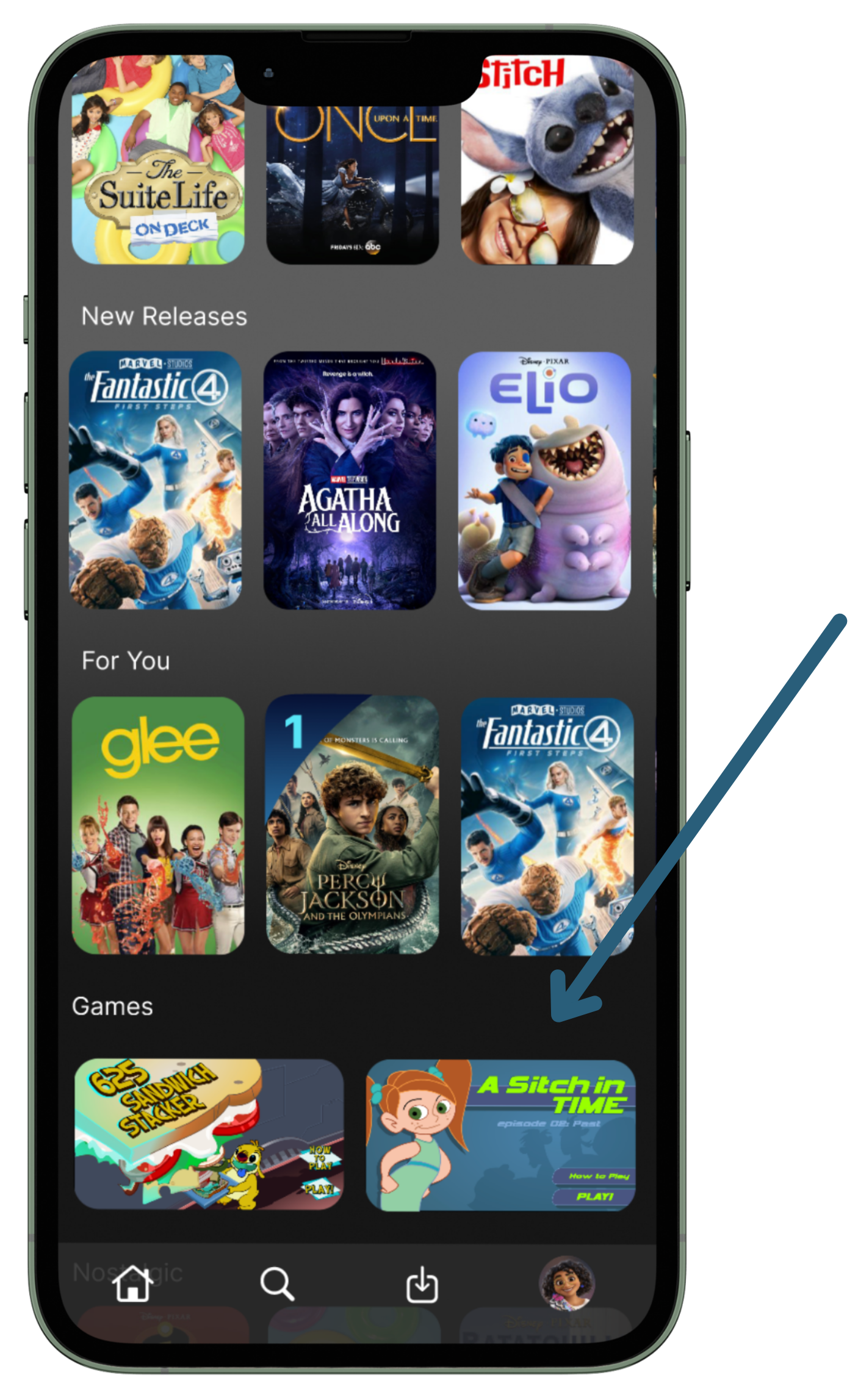
Added the option for games. I added the nostalgic Disney desktop games from the 2000s. This sets the game options apart from places like Netflix because it taps into the nostalgia Disney is known for.
Moved the "continue watching" section to the top
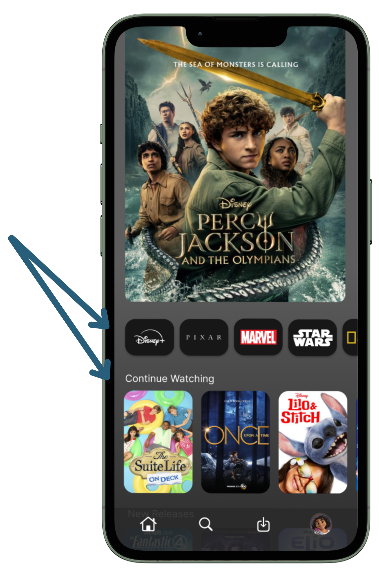
Made a few design changes to make the app a bit more vibrant to align with Disney's vibrant brand identity while improving visual hierarchy.
Impact & Next Steps
Key Improvements
Repositioned "Continue Watching" to top of homepage, addressing the most frequent user complaint.
Added "More Like This" feature to improve content discovery based on user feedback.
Increased visual contrast and hierarchy to reduce the "everything blends in" problem reported by 2/5 of users.
Introduced nostalgic Disney games to differentiate from competitors and tap into Disney's unique brand value.
Next Steps
Conduct usability testing with 8-10 users to validate improvements.
Measure time-to-content discovery and user satisfaction scores.
Iterate based on quantitative and qualitative feedback.
Reflection
This project demonstrated how user research directly translates into design decisions. For consumer insights work, this connection between data, insights, and action is essential.