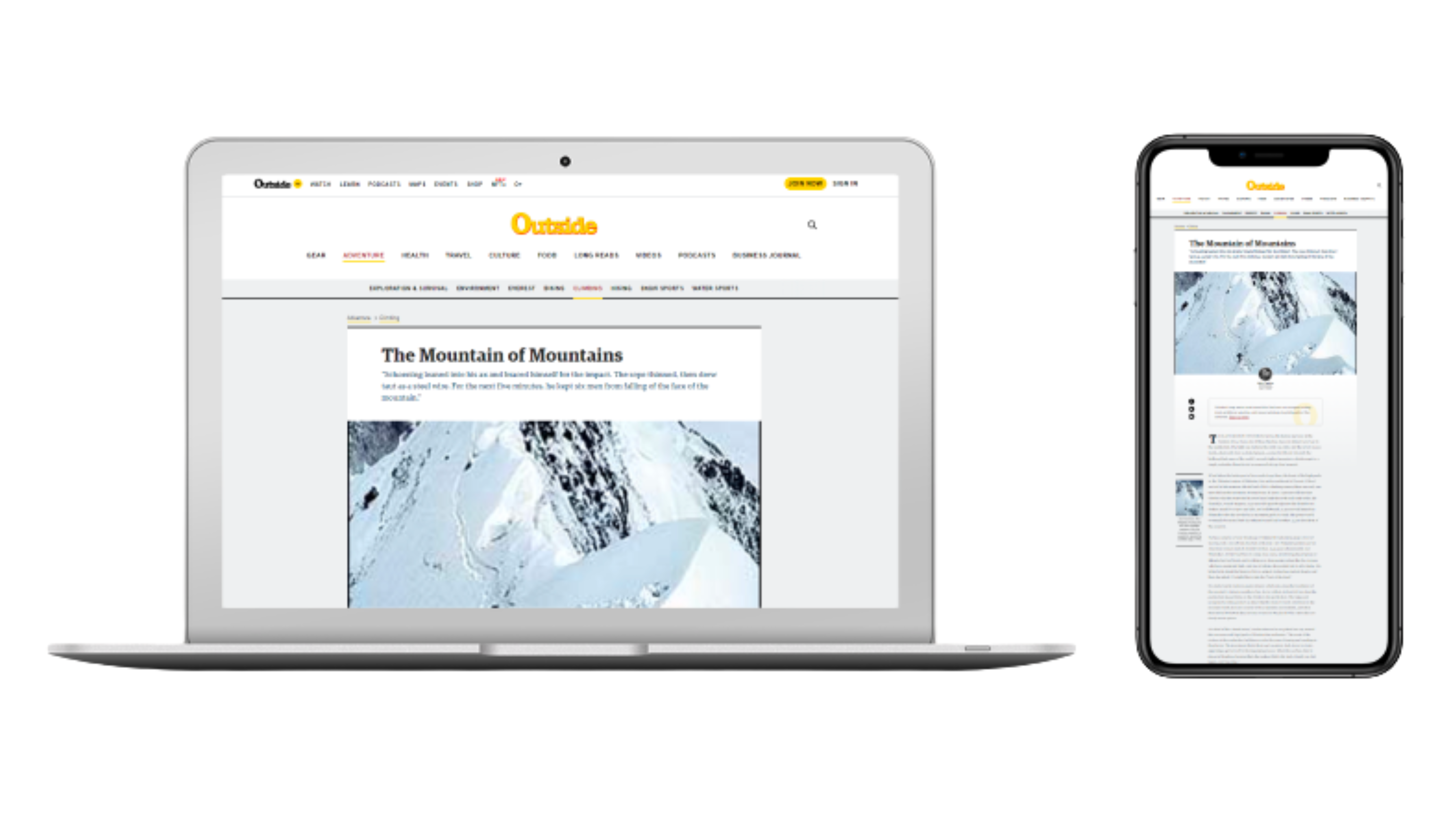
The Problem
The goal after redesigning the interface is to create an immersive, editorial web experience that: Reflects Outside’s updated brand identity, improves readability and image quality and integrates interactive elements and multimedia to enhance engagement.
The hero image is pixelated and low resolution, reducing visual impact.
The overall layout feels outdated and inconsistent with Outside’s modern style guidelines.
There is minimal imagery or interactive media, making the long-form text visually heavy.
New Design
Final Design
I built both desktop and mobile versions in Adobe XD, ensuring responsive structure and smooth transitions between imagery and text sections.
View Desktop Prototype View Mobile Prototype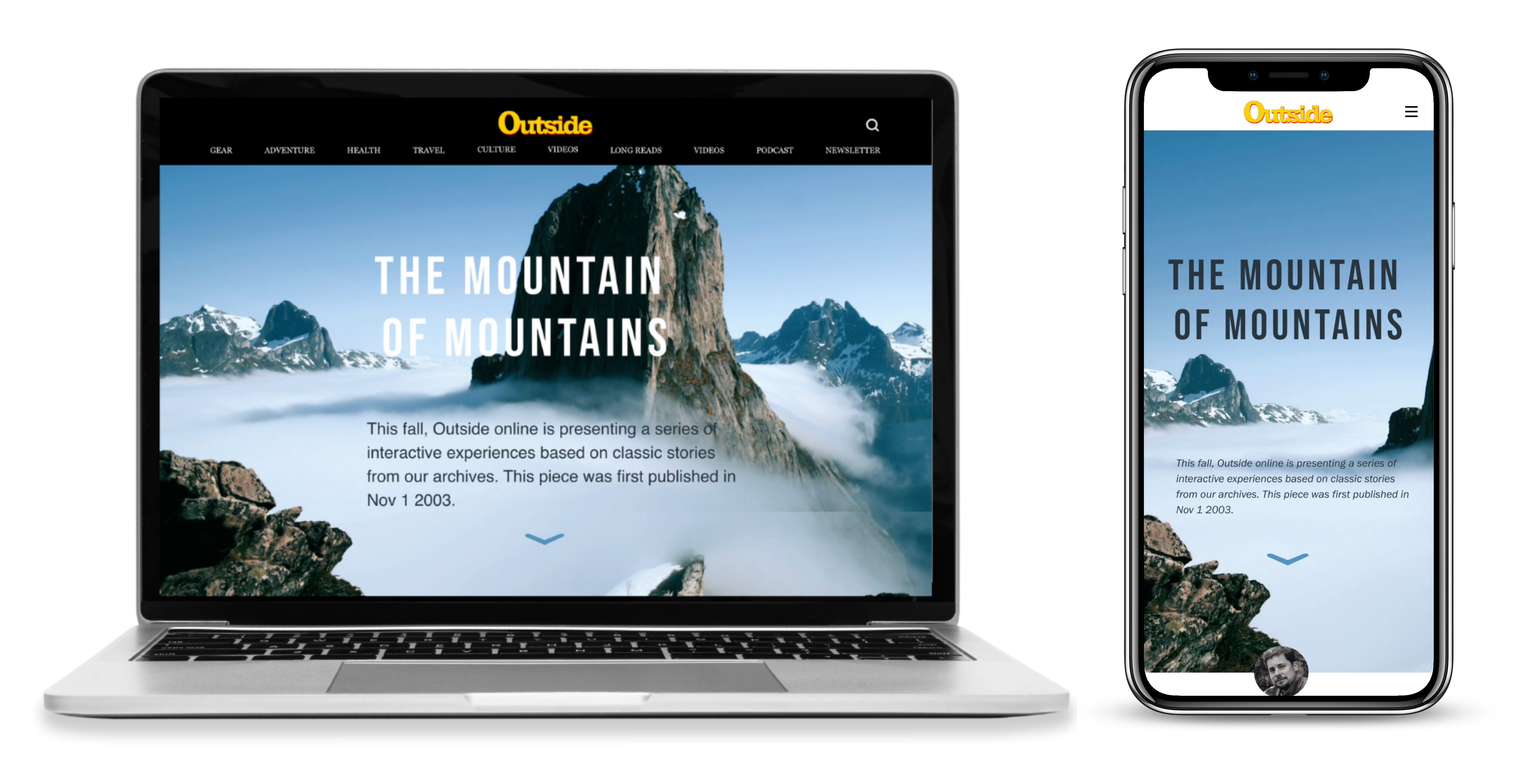
Wireframe
I began by sketching low-fidelity wireframes to experiment with layout hierarchy and balance text and visual rhythm to make the article scannable and engaging.
View Desktop Wireframe View Mobile Wireframe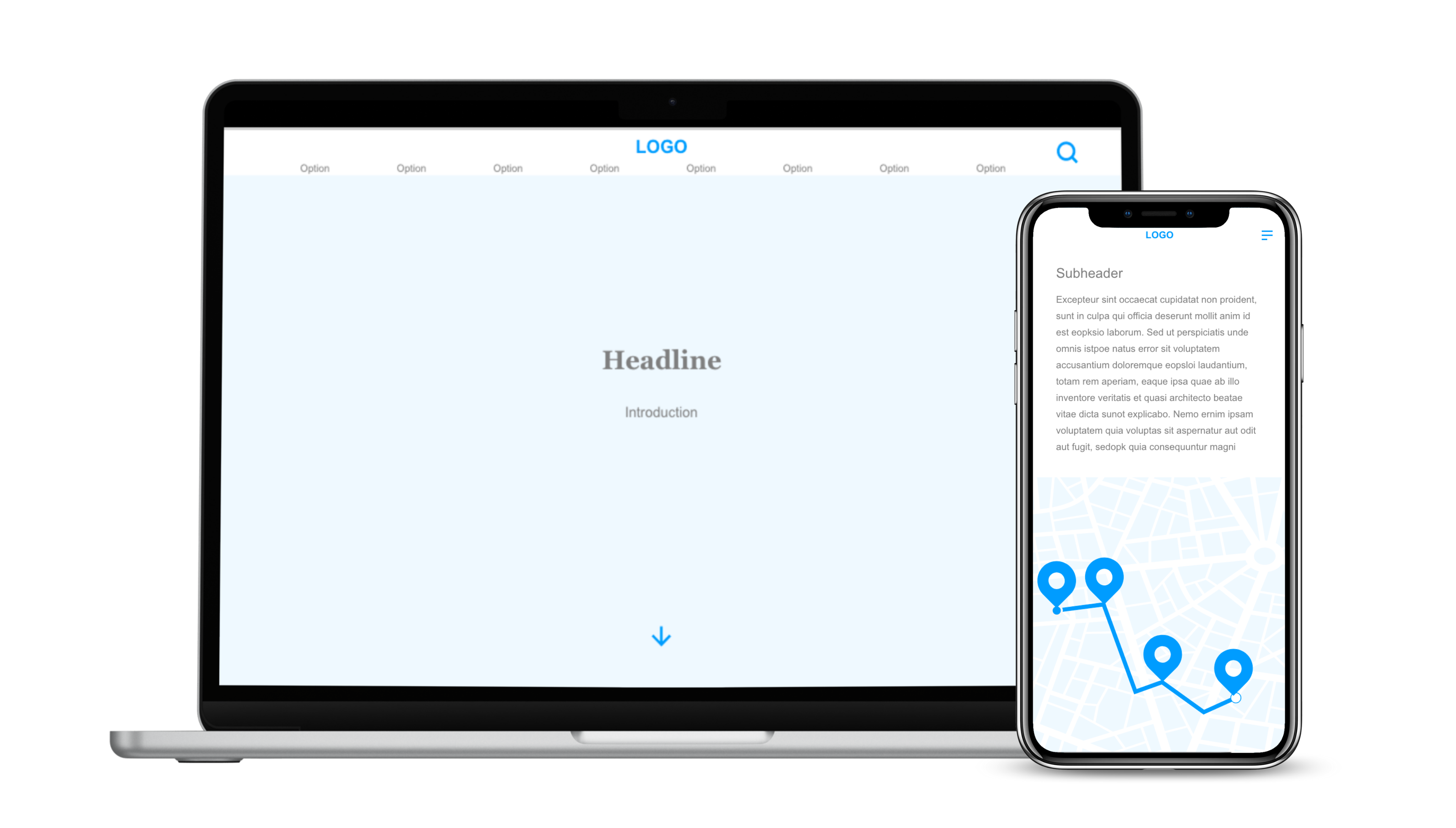
Style Tile
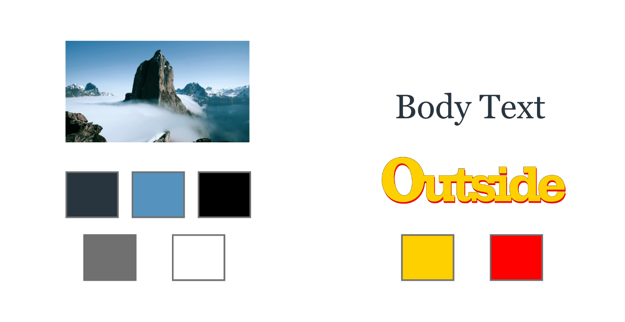
Developed a style tile that drew from Outside’s signature outdoor aesthetic: bold typography, natural color palettes, and clean, breathable spacing.
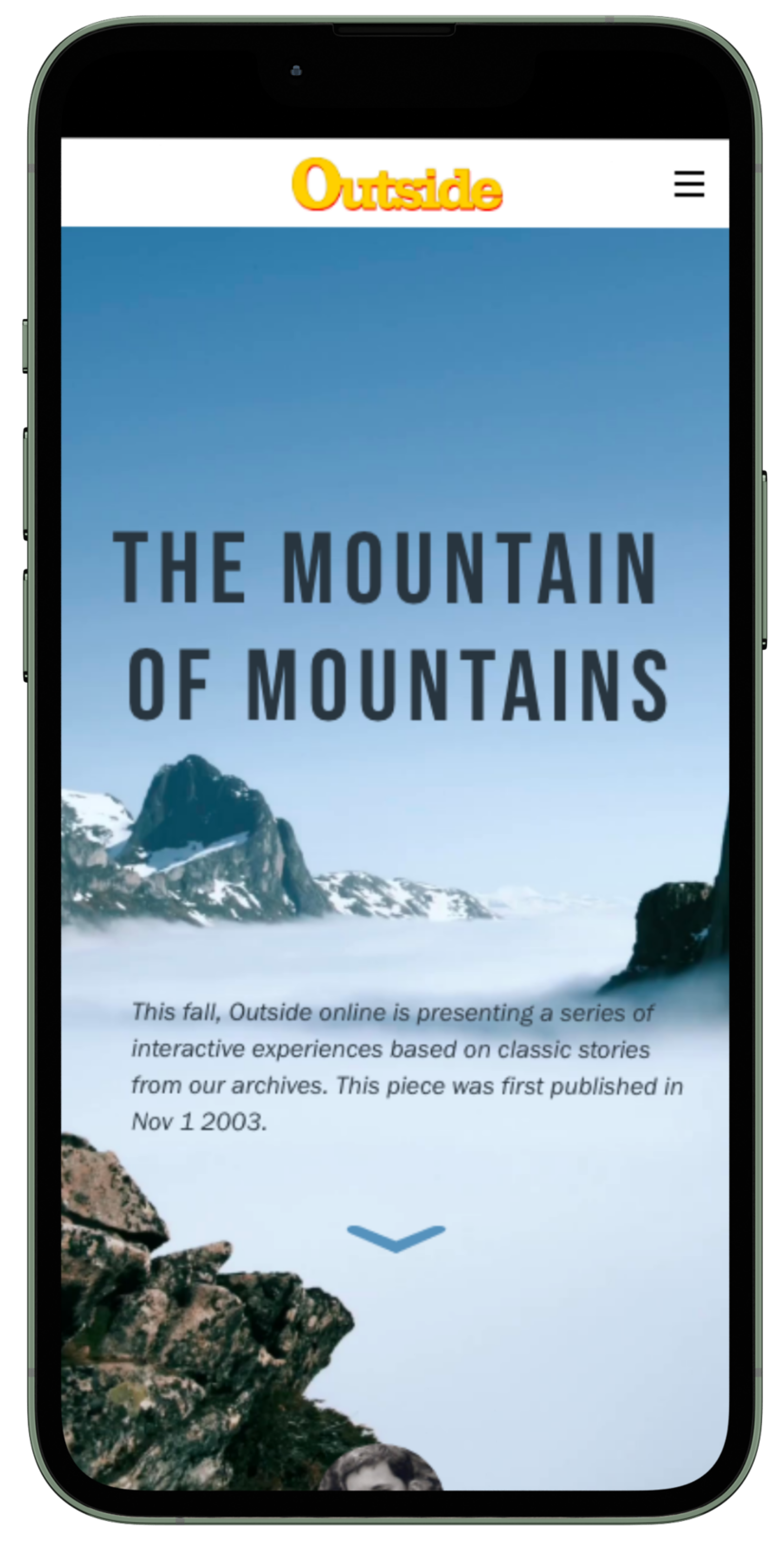
Dynamic hero section with full-width imagery and smooth scroll animation.
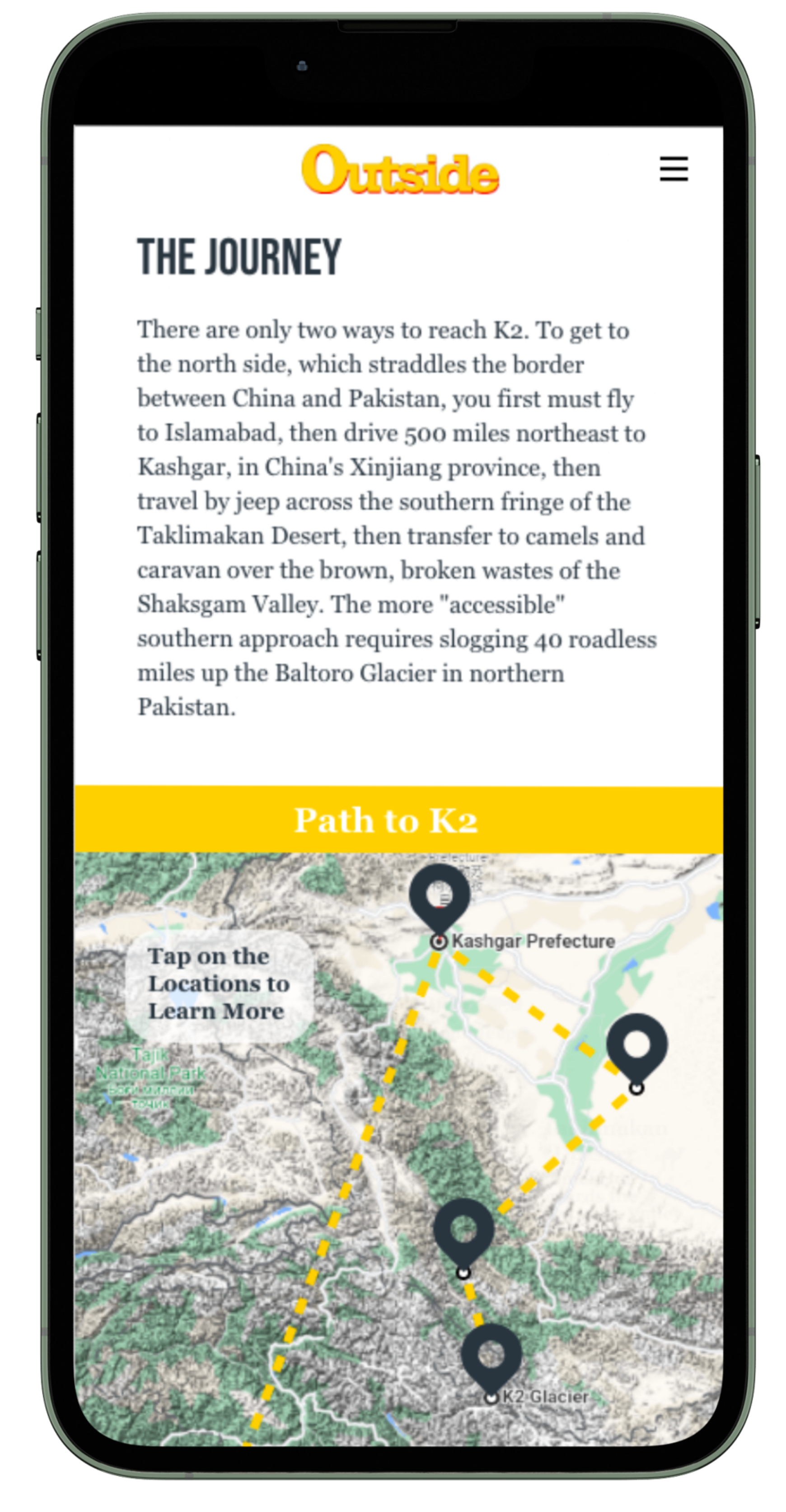
Interactive map interface where users tap on highlighted locations to reveal additional information about each site.
Alternating text and visuals for reader pacing.
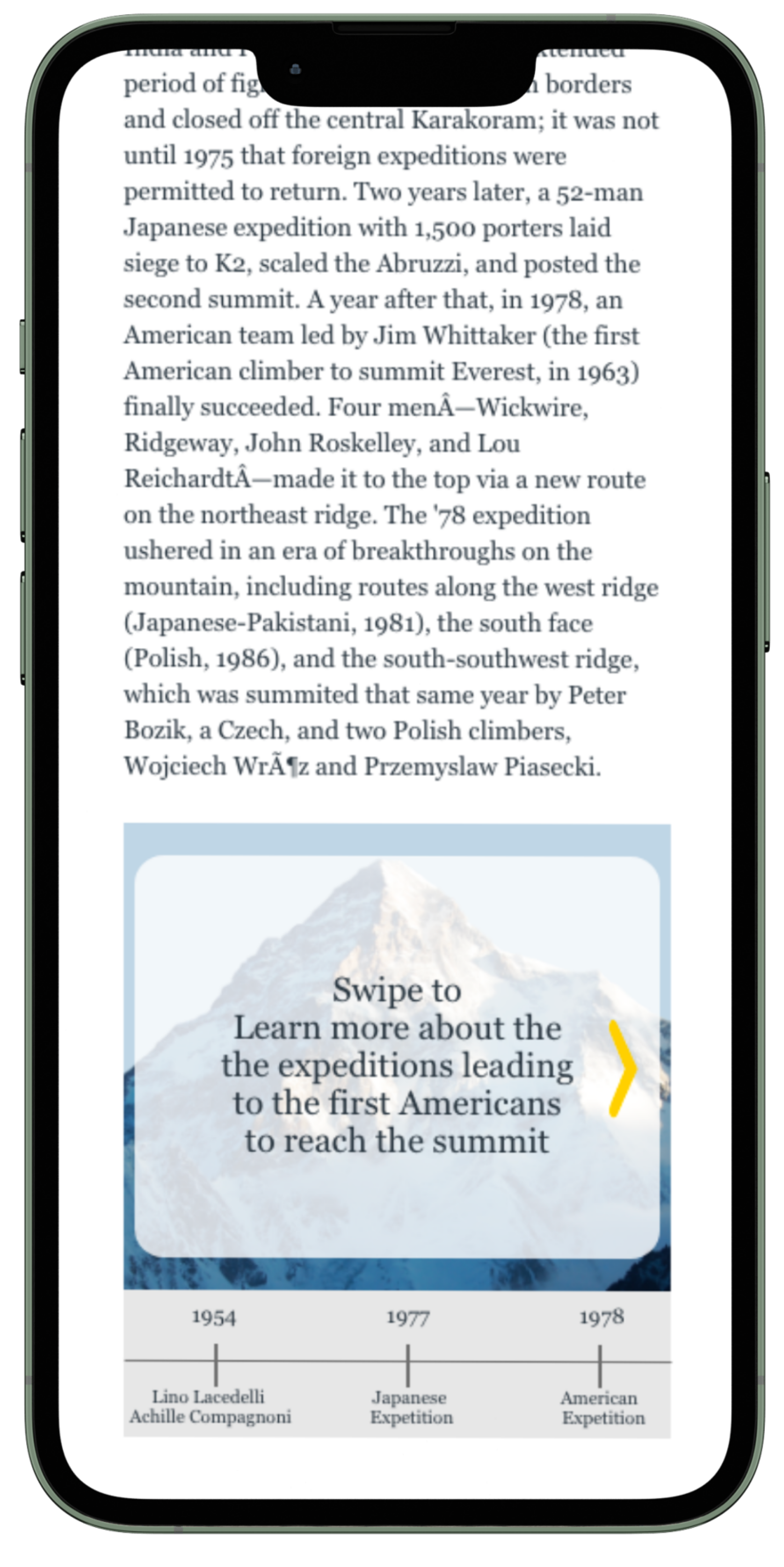
Interactive timeline with audio.
Reflection
This project taught me how to adapt editorial storytelling for digital platforms, balancing aesthetics with usability. It also deepened my understanding of accessibility and responsive design, skills that directly inform my current UX and product design work.