User Research
To evaluate Vanguard’s Year in Review feature, our team conducted a usability study with 5 participants ranging from ages 42–65, including users approaching or already in retirement. We aimed to understand:
How easily users could find and access the feature
How well they could interpret financial insights
How the experience impacted their confidence and understanding of their finances
Through moderated virtual sessions and listening interviews, we observed user behavior, gathered feedback, and identified usability issues across the experience.
Key Insights
The Year in Review feature has strong potential, but its value is not immediately clear to users due to poor discoverability and overwhelming information presentation.
Positive Findings
Despite usability challenges, users responded positively to several aspects of the experience:The interface felt intuitive and easy to navigate
Information architecture was described as clear and organized
Visual design felt approachable rather than intimidating
Interactive elements, like the investment graph, were engaging once understood
Pain Points
Low Discoverability. Users struggled to find the Year in Review feature, especially when it was placed below the fold.
The experience contained too much text and dense information, making it difficult to scan and retain key insights.
Users did not clearly understand what actions Vanguard had taken on their behalf.
The cartoon-style graphics felt out of place and did not meaningfully support the user experience.
Personas
The audience is actively engaged in financial planning with varying levels of financial literacy and tech comfort. These users value clarity, trust, and control. They prefer simple, intuitive experiences and are easily discouraged by complex interfaces
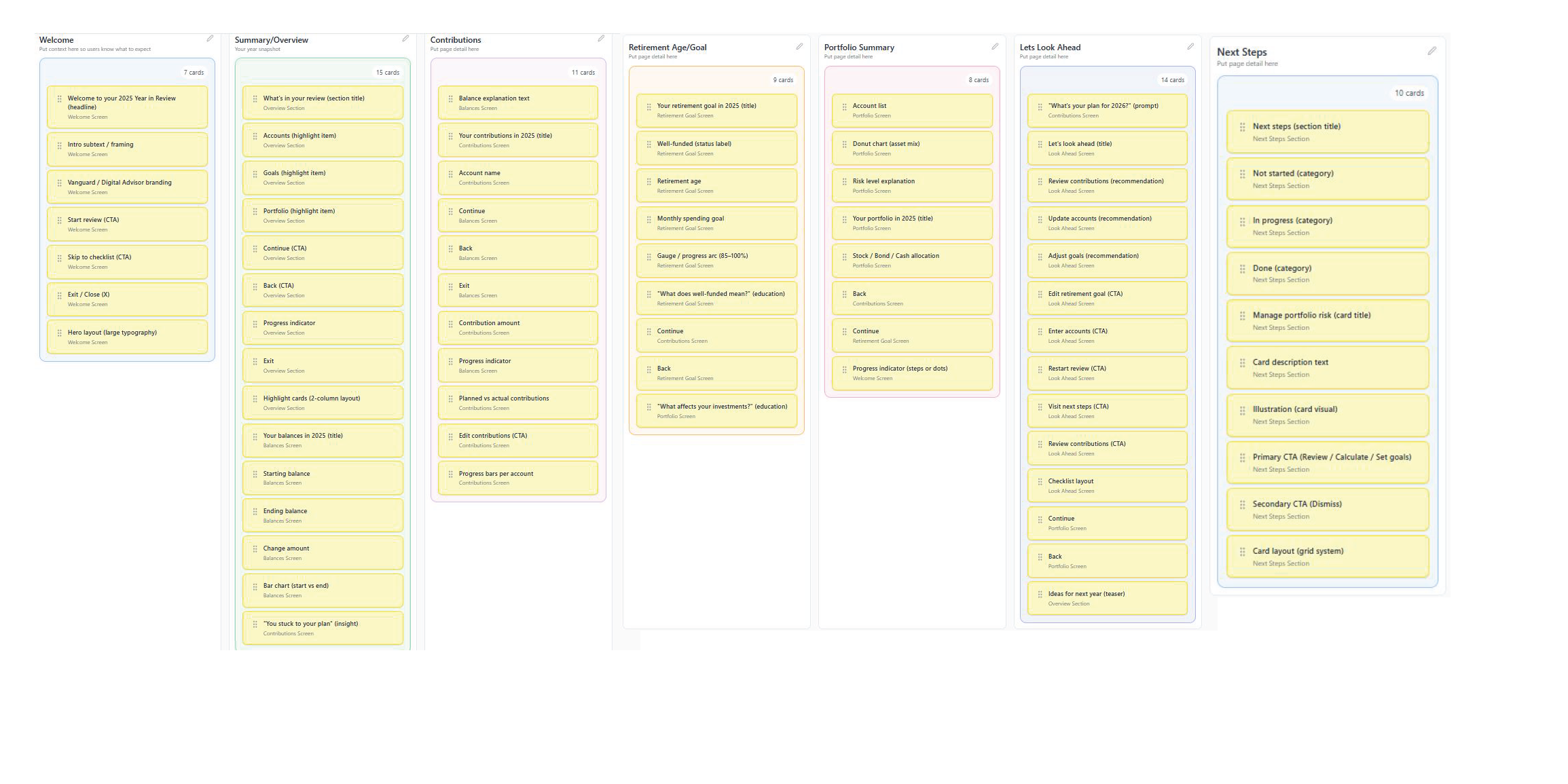
Information Architecture
We created three user journey maps.

Ideation
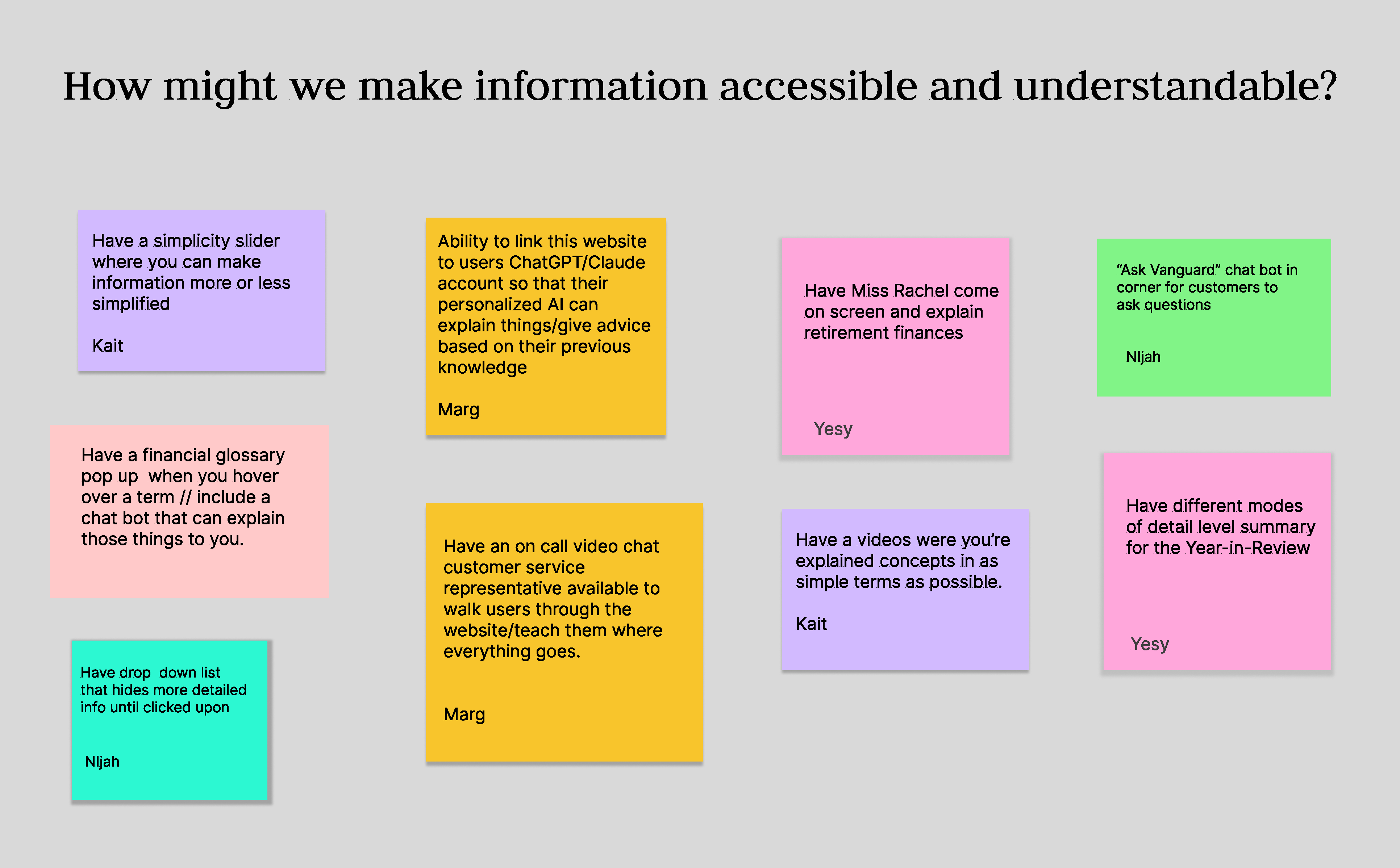
Card Sorting
Solutions
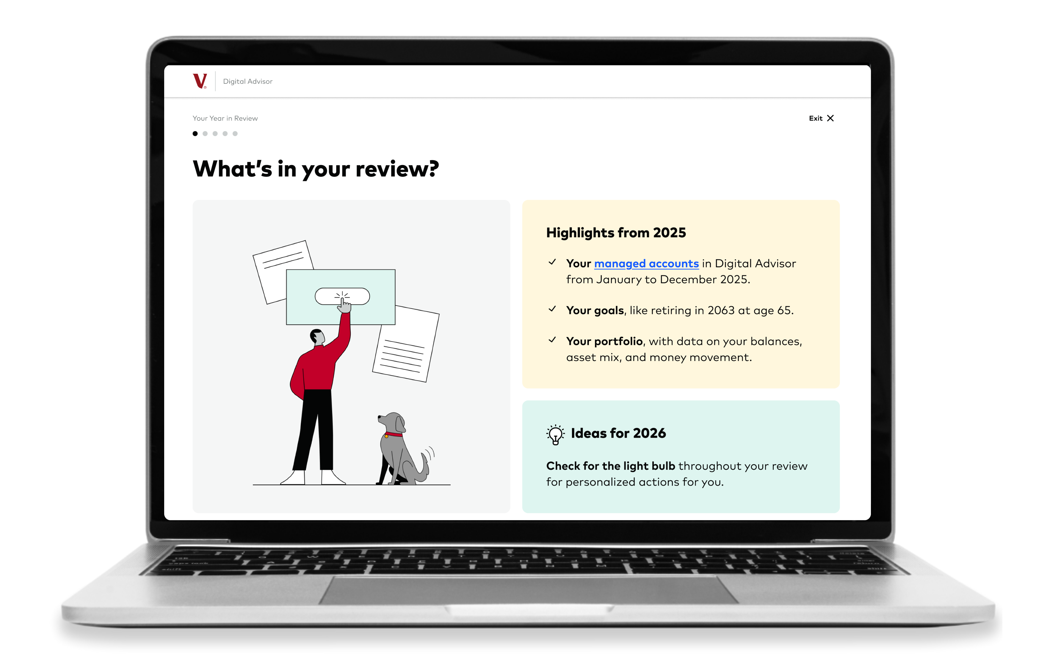
We introduced three levels of detail selection that allow users to control how much detail they see throughout the Year in Review. Users can select their preferred level at the beginning and adjust it at any time, allowing the experience to adapt to their needs.
Three Levels of Detail
Simple
Clear, plain-language summaries with minimal detail
Detailed
Additional context with some financial terminology
In-Depth
Full breakdowns with detailed financial insights and jargon
Single Page Layout
Change the layout to a single page for easier navigation and a more cohesive user experience. Many users prefer a continuous flow of information without having to navigate through multiple pages.
New Design
Final Design
We reduced complexity and improved communication, allowing the feature to shift from a data-heavy summary to a confidence-building financial story for users at all stages of their retirement journey.
View New Design View Previous Design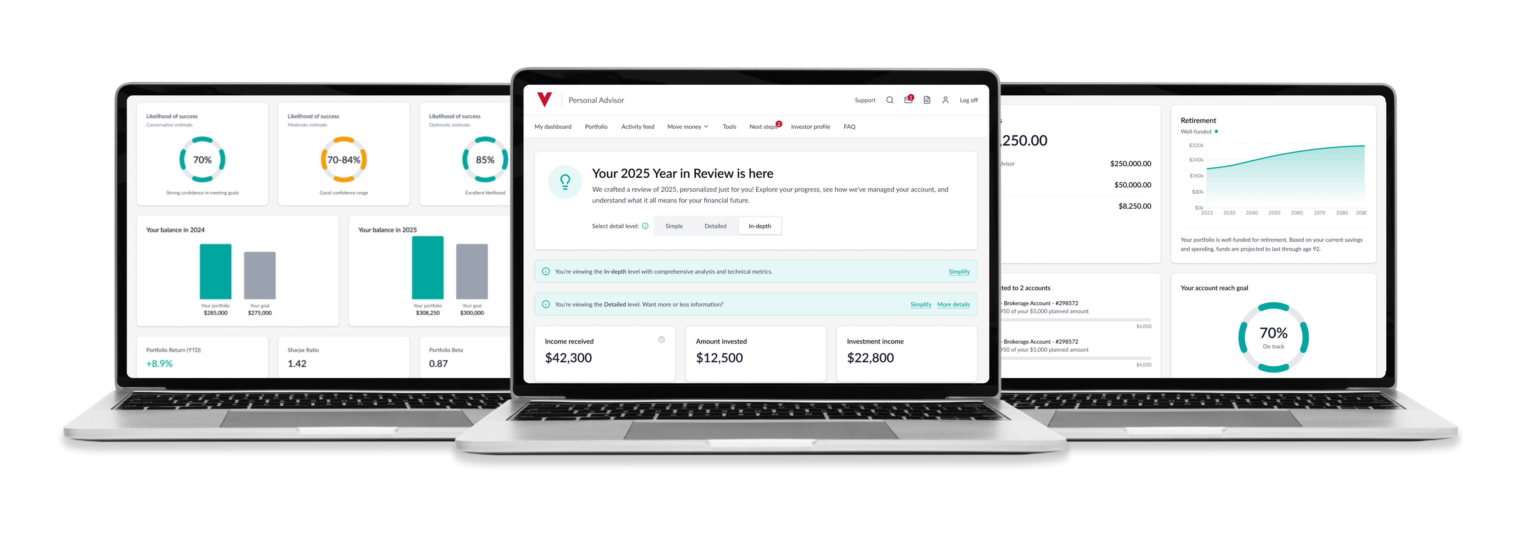
Sketches
Early sketches focused on exploring different ways to present the three levels of detail and experimenting with various layouts to enhance discoverability and user flow.
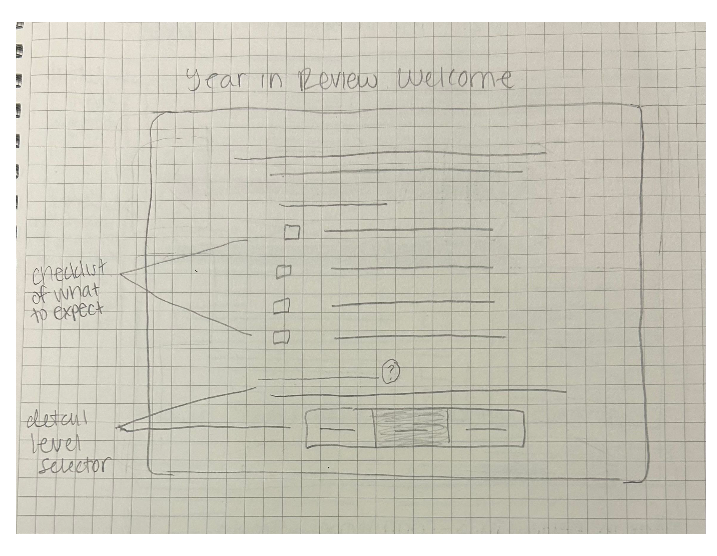
Added three levels of detail to allow users to control how much information they see based on their preferences and needs.
Changed the layout to a single page. The previous multi-page layout made it difficult for users to navigate.
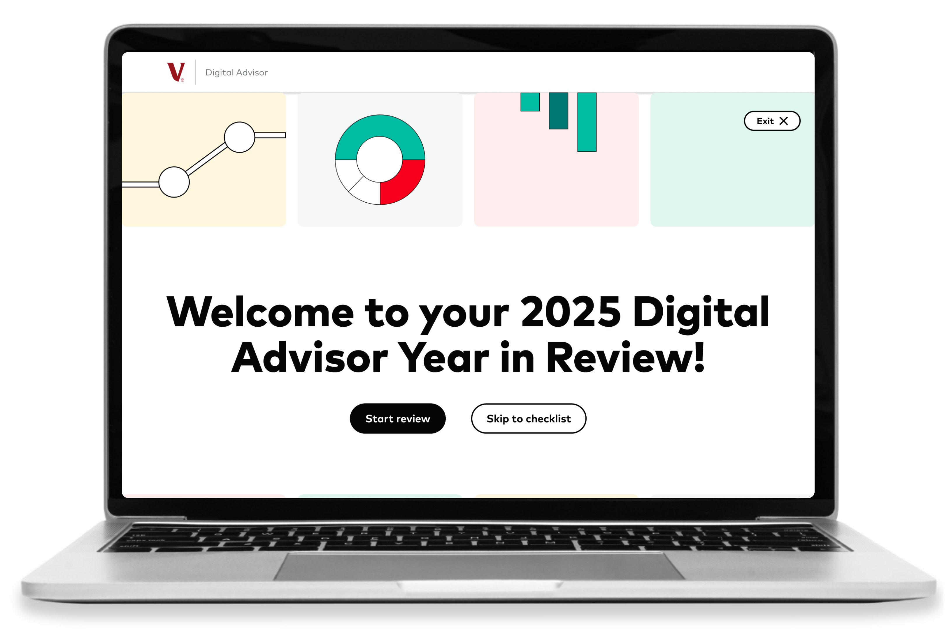
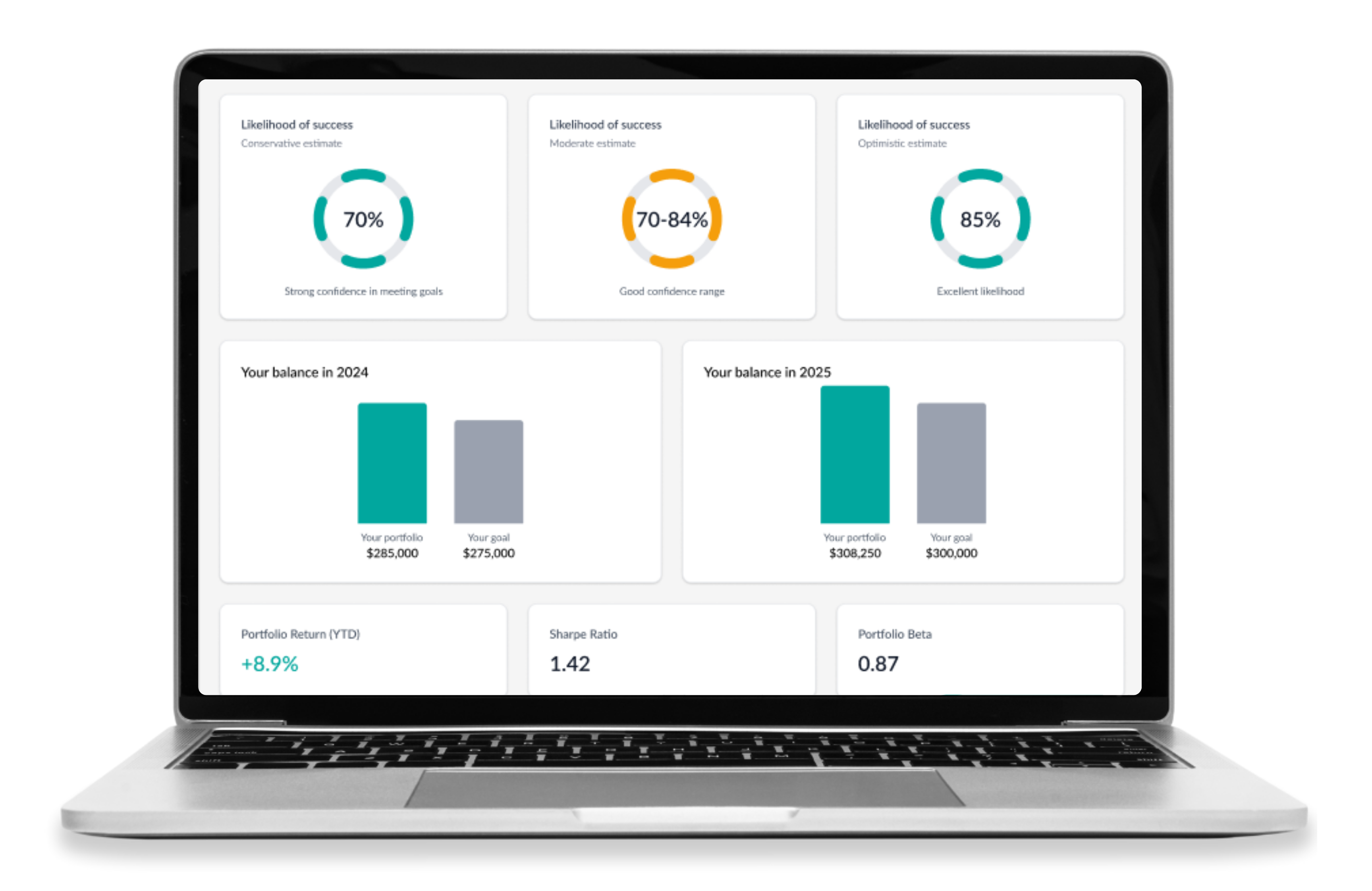
Removed all cartoonish elements. These graphics were not well-received by users and did not meaningfully enhance the experience, so we replaced them with graphs and visuals that better supported the financial storytelling.
Reflection
Working on this project strengthened my ability to think beyond surface-level design decisions and focus on how users truly understand an experience. I contributed to both the research and design process, conducted user interviews, helped identify key usability issues and translate them into actionable design solutions. I also had the opportunity to present our findings and recommendations directly to Vanguard’s UX team, which pushed me to clearly communicate our insights and design rationale in a professional setting. One of my biggest takeaways was learning how to design for varying levels of user knowledge, especially in a space as complex as finance. This project challenged me to think critically about clarity and information hierarchy. It reinforced the importance of balancing detail with simplicity, ensuring that designs are both informative and accessible. Overall, this experience helped me grow as a designer by grounding my decisions more intentionally in user needs and usability principles.